
One of the most popular effects to be used in video games the last years is the effect of chromatic aberration. Chromatic aberration is the effect that can be seen in low-quality camera footage, where on the edges of an object it seems as if the colors have a small offset. Recently it has been sees in many games, and sometimes used excessively. There are also a lot of people that hate this effect because it has been used so much and because they think it looks ugly. Personally, I love chromatic aberration, when used in moderation (hey, that rhymes!). I believe it can make a scene more interesting and I think it looks cool in some cases.
I really liked that Unity had a chromatic aberration image effect, but after a while I got bored of the green-magenta tyranny of the default effect. Especially since there were lots of small budget games that used it. Therefore, I wanted to make my own cool looking chromatic aberration effect, where you could see the actual red, green and blue channels being offsetted, like in “Layers of Fear”. And then the new post-processing stack came along with its fancy chromatic aberration and pissed all over my dreams. BUT! There still wasn’t a built in chromatic aberration effect that affected the whole screen. So I made one. And this is the shader we’ll talk about in this post.
As you will see, this shader is also really simple. It’s concept is really straightforward: get each color channel of the image, and move it slightly. That’s all. And here’s how it’s done:
Shader "Custom/ChromaticAberrationShader"
{
    Properties
    {
        _MainTex ("Texture", 2D) = "white" {}
        _Amount("Amount", Range(0.0, 1)) = 0.0005
    }
    SubShader
    {
        // No culling or depth
        Cull Off ZWrite Off ZTest Always

        Pass
        {
            CGPROGRAM
            #pragma vertex vert
            #pragma fragment frag

            #include "UnityCG.cginc"

            struct appdata
            {
                float4 vertex : POSITION;
                float2 uv : TEXCOORD0;
            };

            struct v2f
            {
                float2 uv : TEXCOORD0;
                float4 vertex : SV_POSITION;
            };

            v2f vert (appdata v)
            {
                v2f o;
                o.vertex = UnityObjectToClipPos(v.vertex);
                o.uv = v.uv;
                return o;
            }

            sampler2D _MainTex;
            float _Amount;

            fixed4 frag (v2f i) : SV_Target
            {
                float colR = tex2D(_MainTex, float2(i.uv.x - _Amount, i.uv.y - _Amount)).r;
                float colG = tex2D(_MainTex, i.uv).g;
                float colB = tex2D(_MainTex, float2(i.uv.x + _Amount, i.uv.y + _Amount)).b;
                return fixed4(colR, colG, colB, 1);
            }
            ENDCG
        }
    }
}
How it works:
I defined the “_Amount” var to use it in order to determine how much apart the color channels will be. Instead of just saying “float” I’m using “Range(0.0, 1)” to clamp it from 0 to 1. Again, everything interesting is in the fragment shader. For each of the red, green, and blue channels, I use the tex2D function to get what the camera sees and then get just the corresponding color. However, in the red and blue channel, I don’t just use the “i.uv” for the uv coordinates as usual. Instead, I add or subtract the “_Amound” variable from the x and y axes of the coordinates. Therefore, I apply the “_MainTex” onto UV coordinates that have been shifted, either towards the upper right corner or towards the lower left corner. After I get these values, I just use them in a new fixed4 variable, with alpha set to 1. Job’s done.
You will see that this effect is really intense, hence you will probably want to use really small values. Also, it’s obviously not necessary to offset the channels the way I did it. There are plenty of options you can play around with, like for example having different properties for the x and y offset. You can also play around with combining colors, in order to get other color combinations.
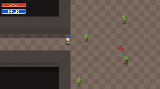
Finally, because this effect is for the whole screen, not just the edges, I would advice you to use it in moderation. A really nice way to use these kinds of effects is to emphasize on events in order for them to feel more impactful. Like the way I used chromatic aberration in “Liches and Crawls”:
I didn’t go too much in depth with this shader, both due to its simplicity and due to the fact that most of the basics have been covered in previous blog posts. Nevertheless, I hope this post helped you in some way.
See you in the next one!


